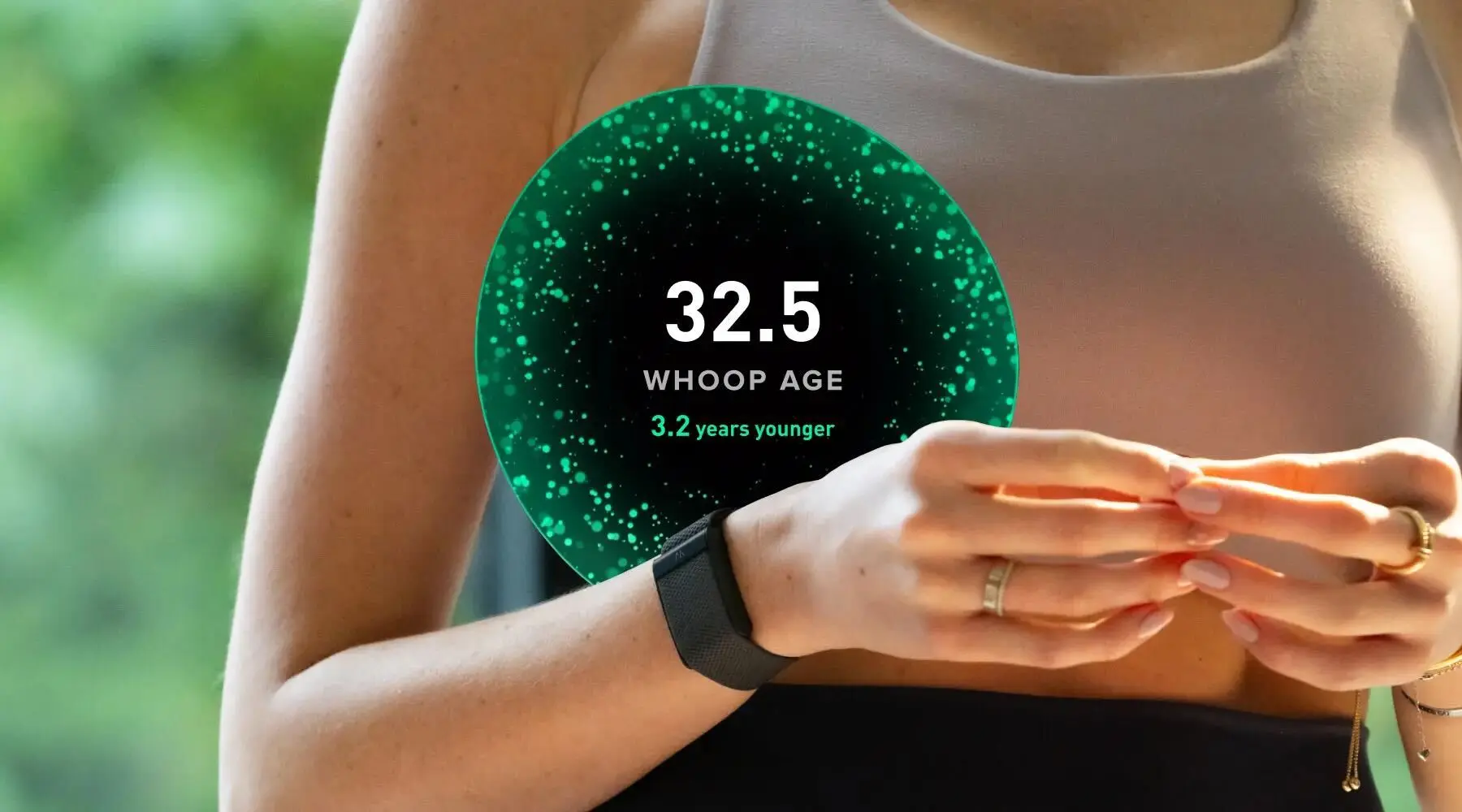
WHOOP Advanced Labs: Lab results meet daily coaching
Topics
App & Features
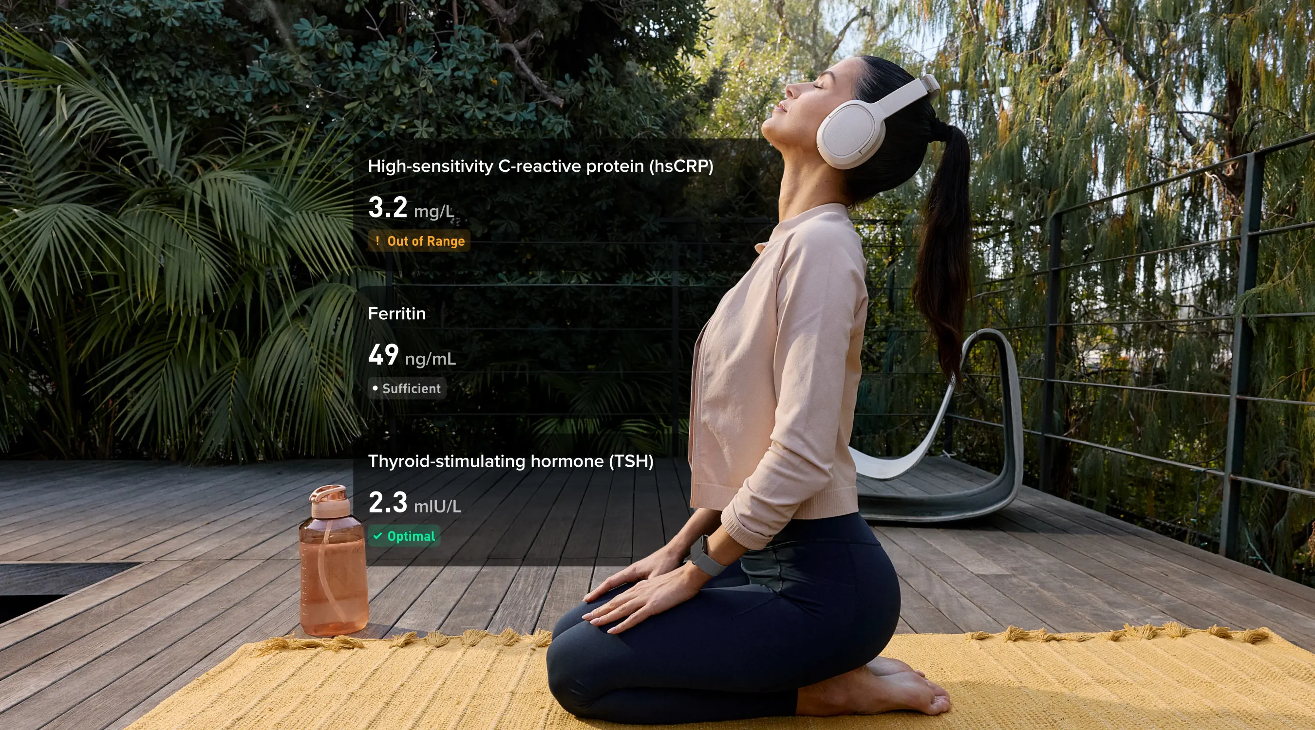
Read articleHealth Biomarkers: 10 Key Metrics with WHOOP Advanced Labs
Read articleDr. Dan Henderson on How We Developed WHOOP Advanced Labs
Read articlePodcast 344: Introducing the All-New WHOOP Advanced Labs: Bloodwork, Biometrics, and AI Coaching
Read article
Available wherever you listen